Comments on my Risk Chart, please.
-
I'm a complete amateur who is just playing with the markets, but I've just developed my own Risk Graph (it must be a reinvention of the wheel), but here it is...
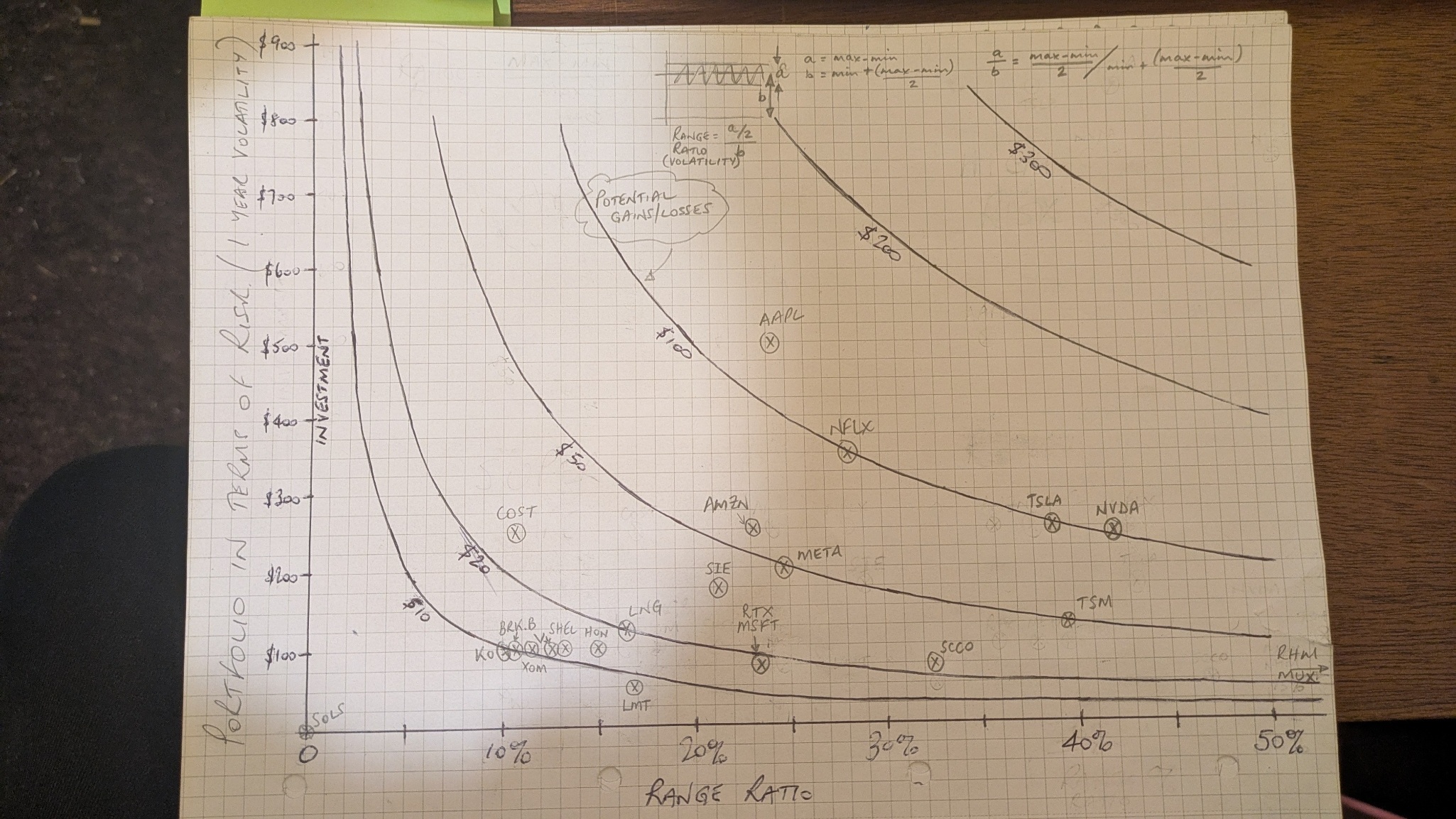
The crosses are random, but hopefully show the intention.
The curved line shows the estimated maximum gain/loss for the investment based on the highest and lowest share prices in the last 52 weeks (found via GOOGLEFINANCE).
My largest exposure is AAPL (where I could lose or gain around $120 per year), and my smallest exposure is LMT where I could lose or gain around $9 in a year.
Is the chart completely useless, or is it a reasonably easy way to determine risk?
-
Good start but a few thoughts.
Using the 52-week high and low makes the swings look bigger than they usually are — it shows the extremes, not what’s likely.
Mixing dollar amounts (how much you could gain or lose) with percentage moves (volatility) muddles the scale a bit.
It doesn’t factor in how your holdings interact with each other — no sense of diversification or correlation.
The curves you’ve drawn look neat but don’t actually have a mathematical basis.Swap the high-low range for a proper measure of volatility, like standard deviation or beta. Google that
Use expected return (what you realistically think you’ll make) instead of the biggest possible gain.
Put everything in percentages, not £/$, so you can compare stocks properly. -
I would only add - and do this with some spreadsheet, not hand drawn graphs

Mainly because you can tweak and adjust things VERY rapidly with a spreadsheet
 ️
️
My main finance sheet has broad aims for growth - I don’t dabble with individual stocks.
I use what I hope will be pessimistic numbers: I set a ‘desired’ annual income to rise 5%, S&S broadly to rise 3%, cash savings at 1%. Pensions (we have 3 small ones) at 2%, State Pensions at 2.5% (triple lock).I can play with crashes on things when I want to be pessimistic 🫣
Now well over 4 yrs into no wage, I have a monthly one so I can update the ‘actuals’ on a monthly basis
It’s a small hobby for me, & I probably spend too much time fiddling with spreadsheets, but it keeps me happy
-
@mikeiow I'm in a similar boat. Too much time on my hands and with a few pennies to spend at the bookies (I mean stock market).
I used a spredsheet to come up with the chart, but couldn't produce anything other than dots on a scatter chart. There were no labels next to each dot, other than their value. I, also, couldn't produce the curves on the same chart.
@Adam-Kay thanks for the steer. I'll do some googling at SD and beta.