The fund performance graphs - Have they gone?
-
I recall IM eventually had those charts available so you could review the long term performance.
I remember it was added because people would otherwise just add £100 to each fund so they could easily keep an eye on relative performance over time.
I'm looking high and low and all I can seem to find are the product sheets with Will Dicksons face on them, which as before look really nice, but aren't what I want to see when looking at historical performance.
Am I missing something, or is it back to putting £100 in each fund option to keep an eye on it's performance?
Many thanks
-
Bump. Tried looking for these again today.
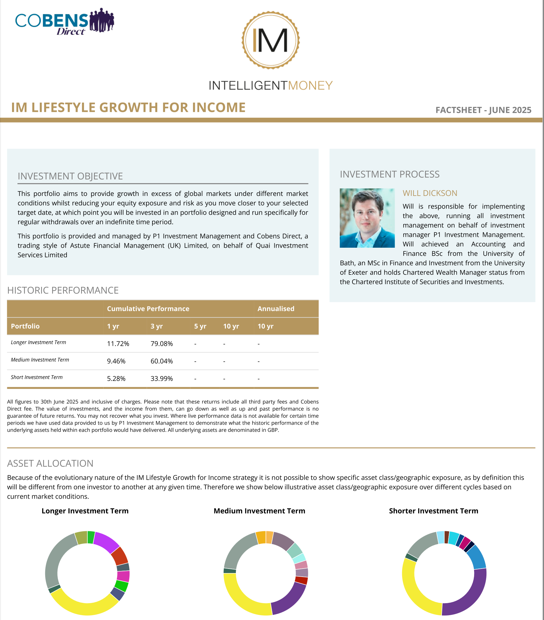
Are we genuinely back to having £100 in each fund so we can track the performance of funds and how they react to the market events over time?
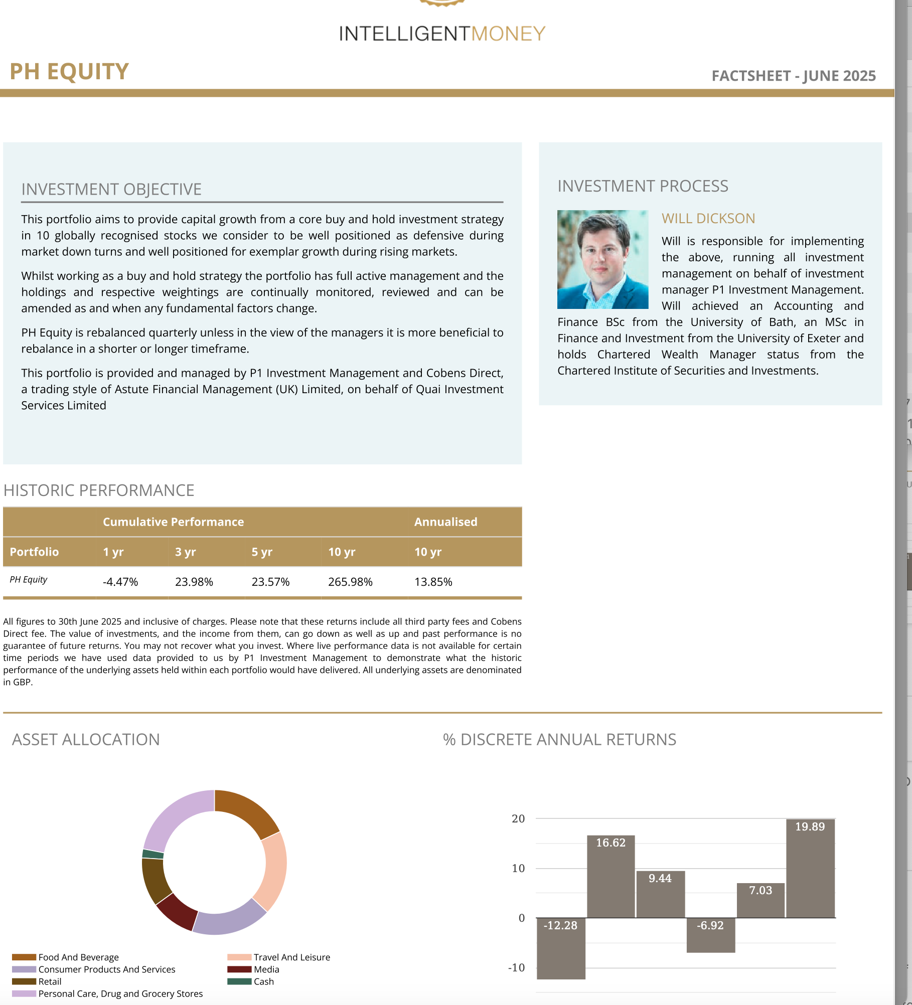
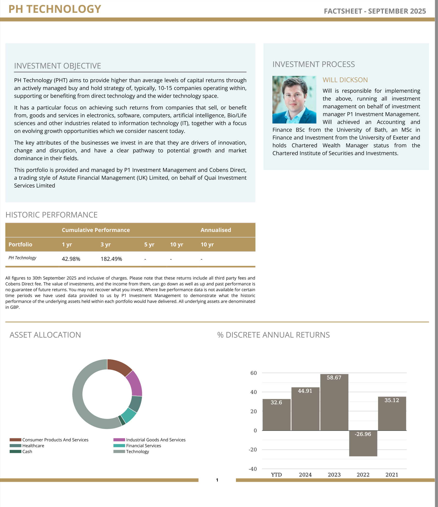
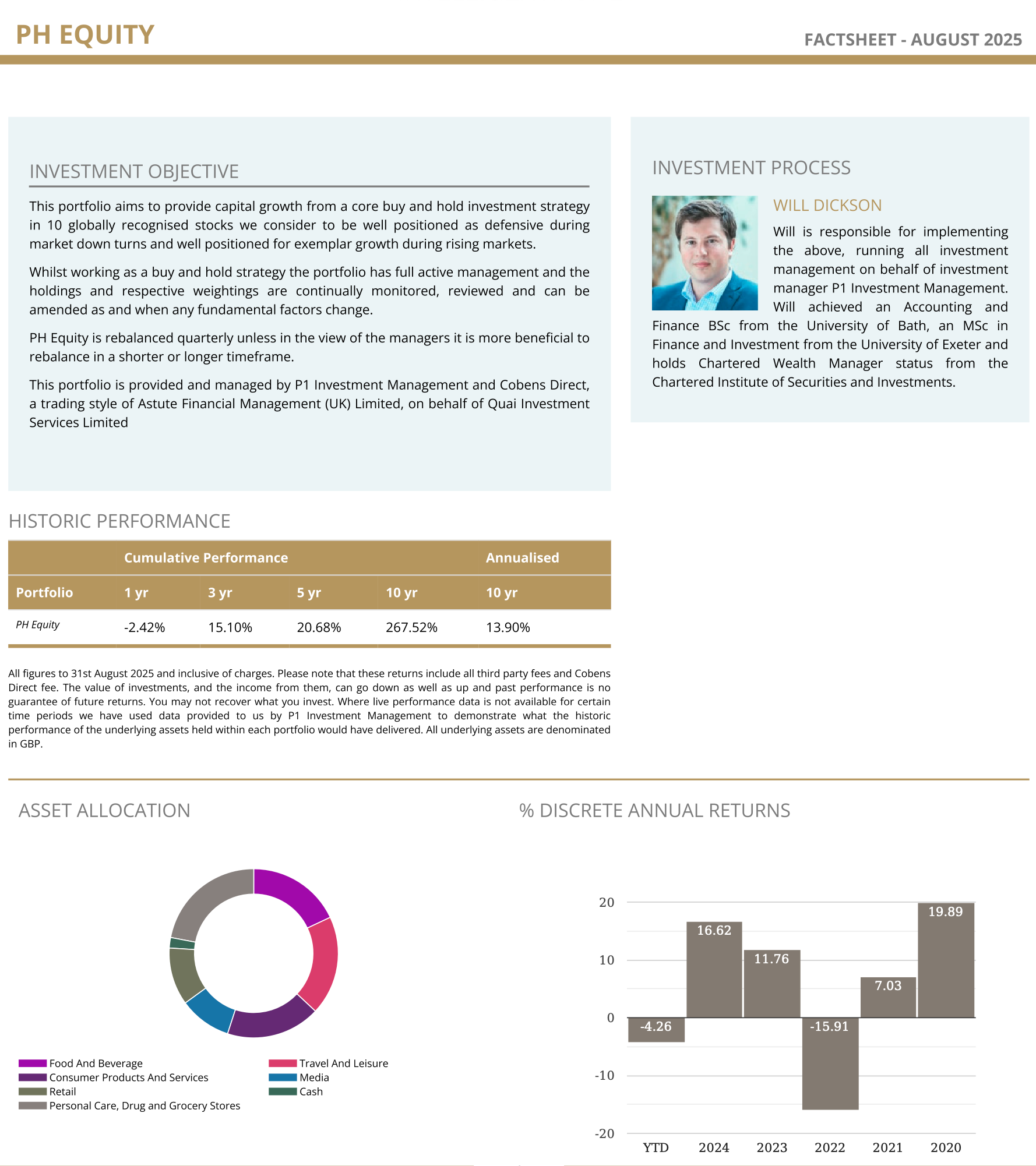
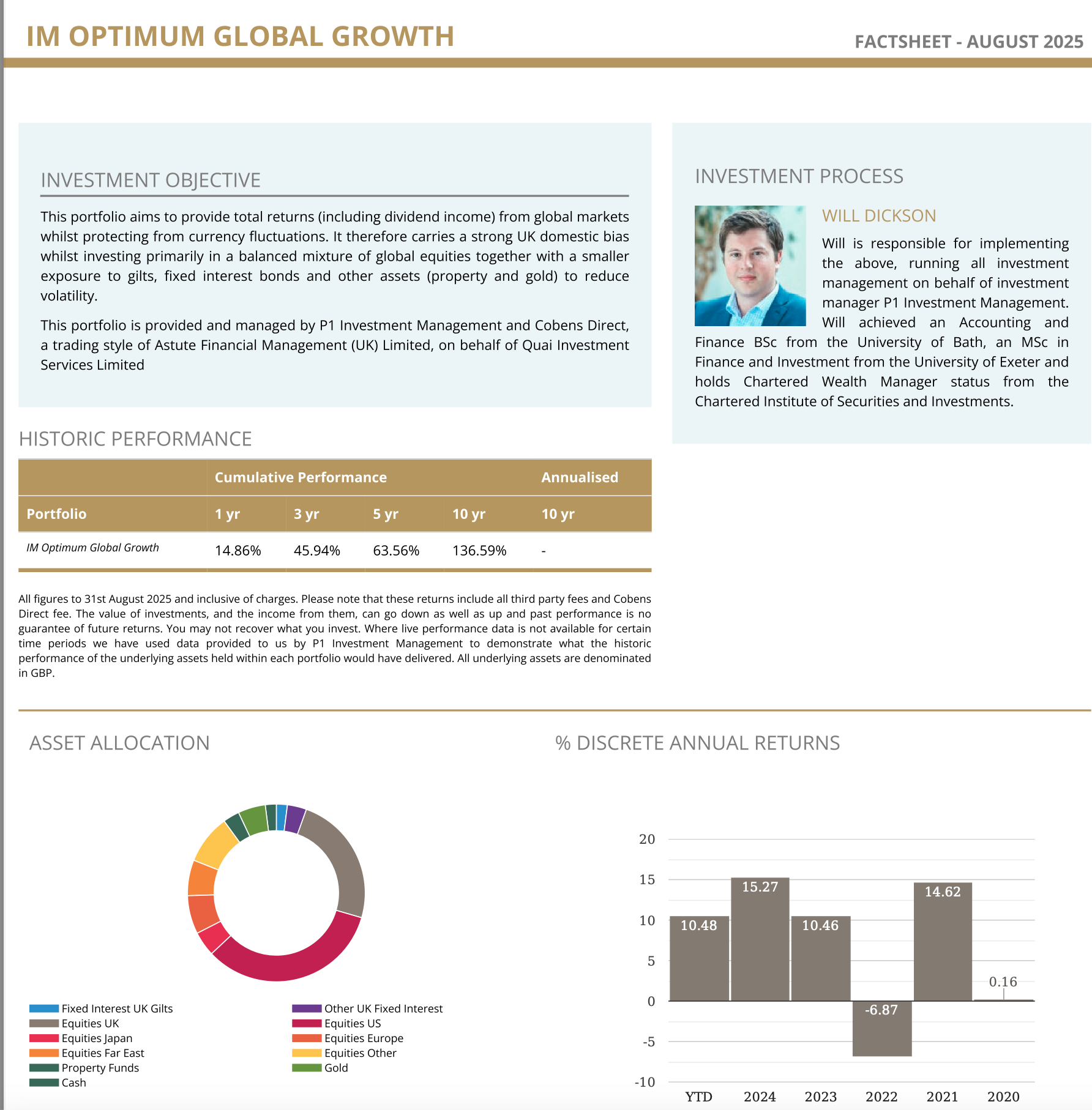
Ie, PHE looked to take a hit back in April but hasn't recovered, while PHT has.
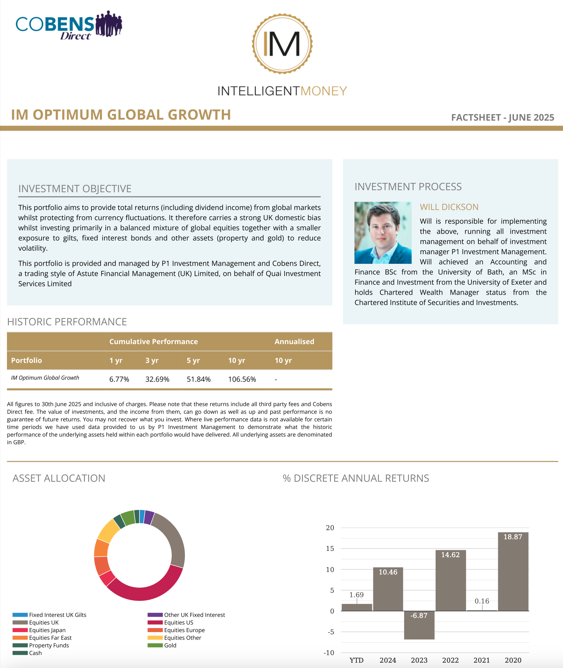
However the 1/3/10 yr performance bar charts on the fund PDFs simply don't show this kind of insightful information.
-
Hi,
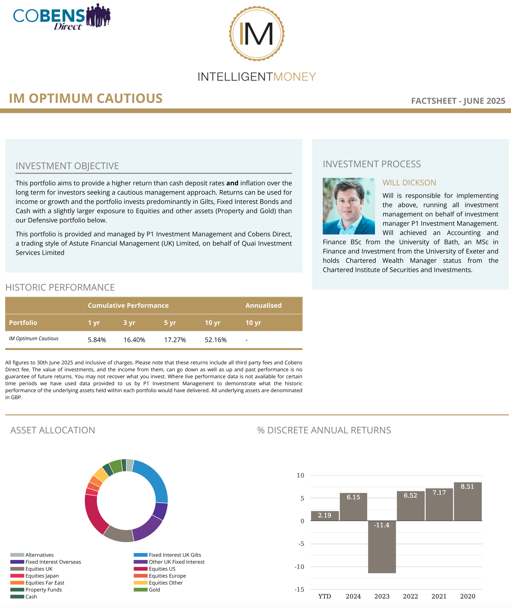
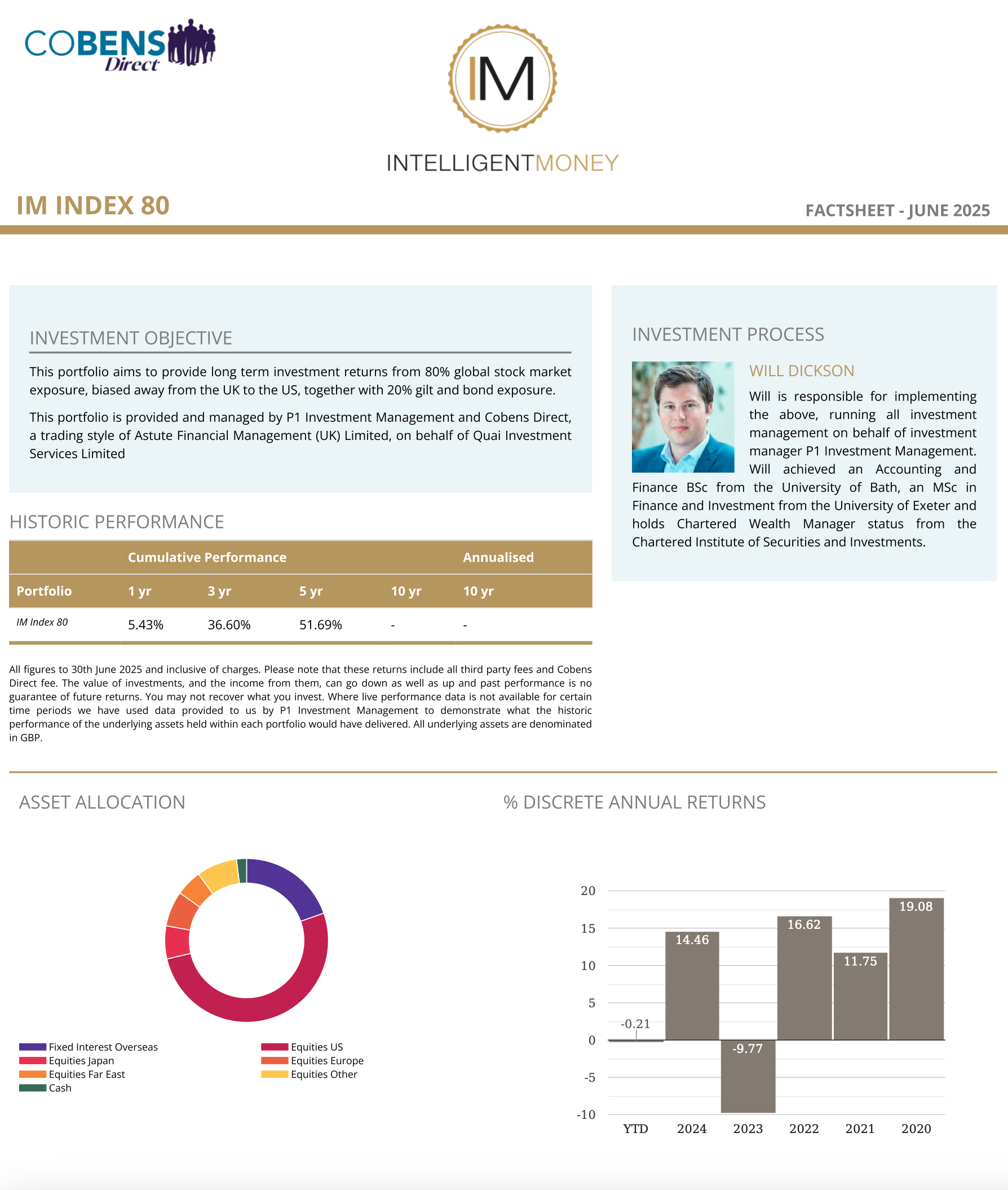
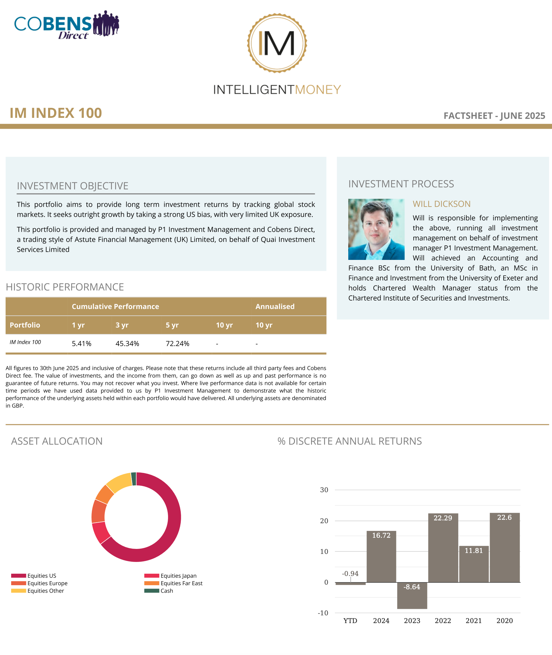
I assume you mean these:

Unless you hold the asset you can't track it intra period. I will post the main Fact Sheets when June is widely available-in the next day or so. -
Very soon you will be able to access them monthly
-
-
Any chance the latest (june 2025?) PH T can be updated to the portfolio link please? https://www.cobensdirect.co.uk/literature-library The PH T link - https://www.cobensdirect.co.uk/_files/ugd/5a2d13_bf43d9165d094bb4a69e8acbfaf6207b.pdf Still gives the Nov 2024 version. Thanks
-
August it's 37% for YTD-everything else the same
-
These are net of all costs and to SEPTEMBER -the month on the FS is showing as August-will be changed-it is September
TECH
-
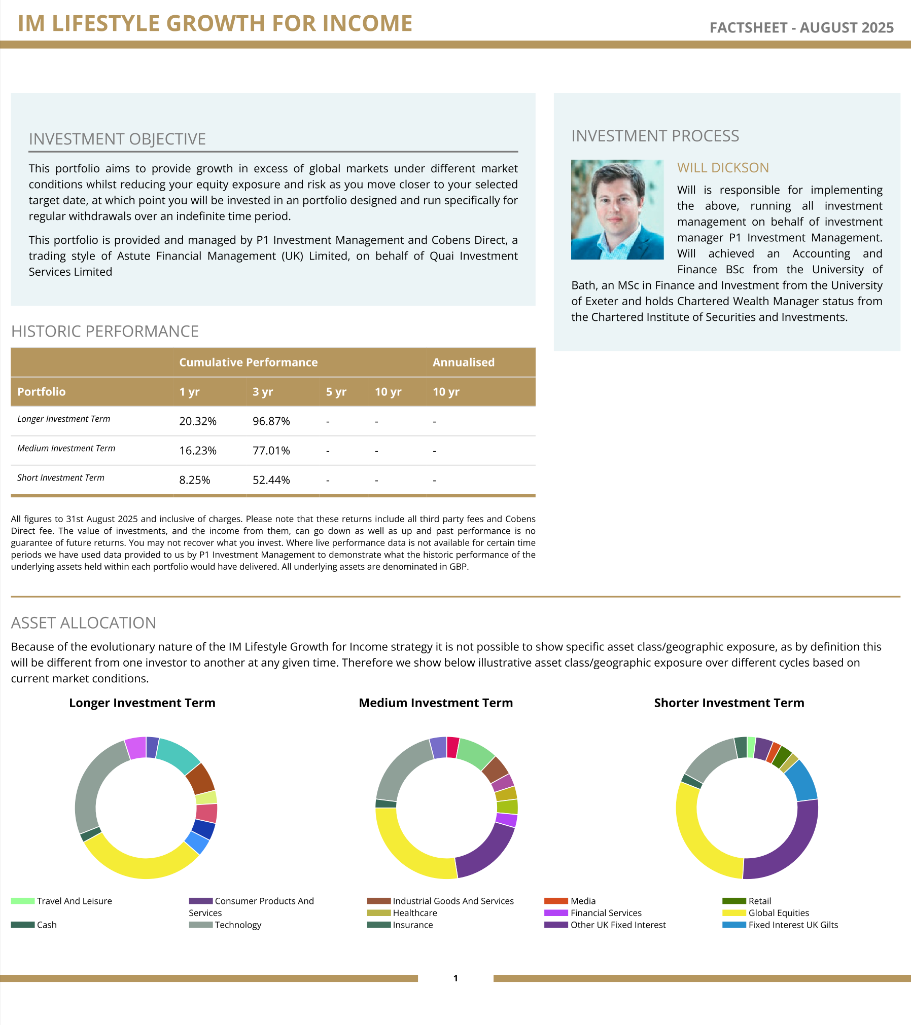
It's because the strategy covers 1 of 3 portfolios and that is driven by 'your' target date. We don't report it by portfolio on the factsheets (yet) but anyone who wants to know
I track them internally by model:
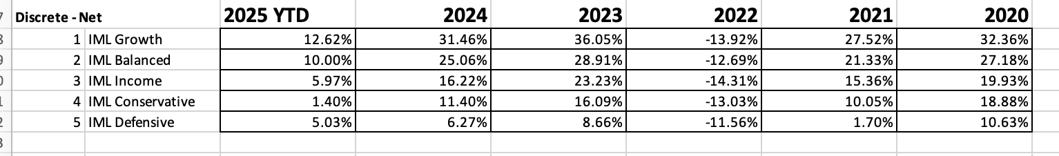
-
These are net of all costs and to SEPTEMBER -the month on the FS is showing as August-will be changed-it is September
TECH
-
FYI, I noted someone is posting our factsheets online with numbers which are incorrect. The Tech FS, 1 y is +42.98% NOT 24% as they falsely claim. They also state our tech returns are 'poor' and no better than the nasdaq 100 index.
The truth is our tech portfolio is ahead of the Nasdaq by circa 100% and is Nr 1. We do not hedge fx, nor one does for Equity based products and the only reason you would claim to do so is to artificially and materially boost returns.
-
Id say it's consistent with their magic portfolios-you know, pick winners after the fact and call it 'genius'. Oh, and then fix the fx rate to some time in the past and add another 30% for good measure.
-
ExIM,
No problem, no intention of engaging but im not about to let intentional misinformation go unchecked.